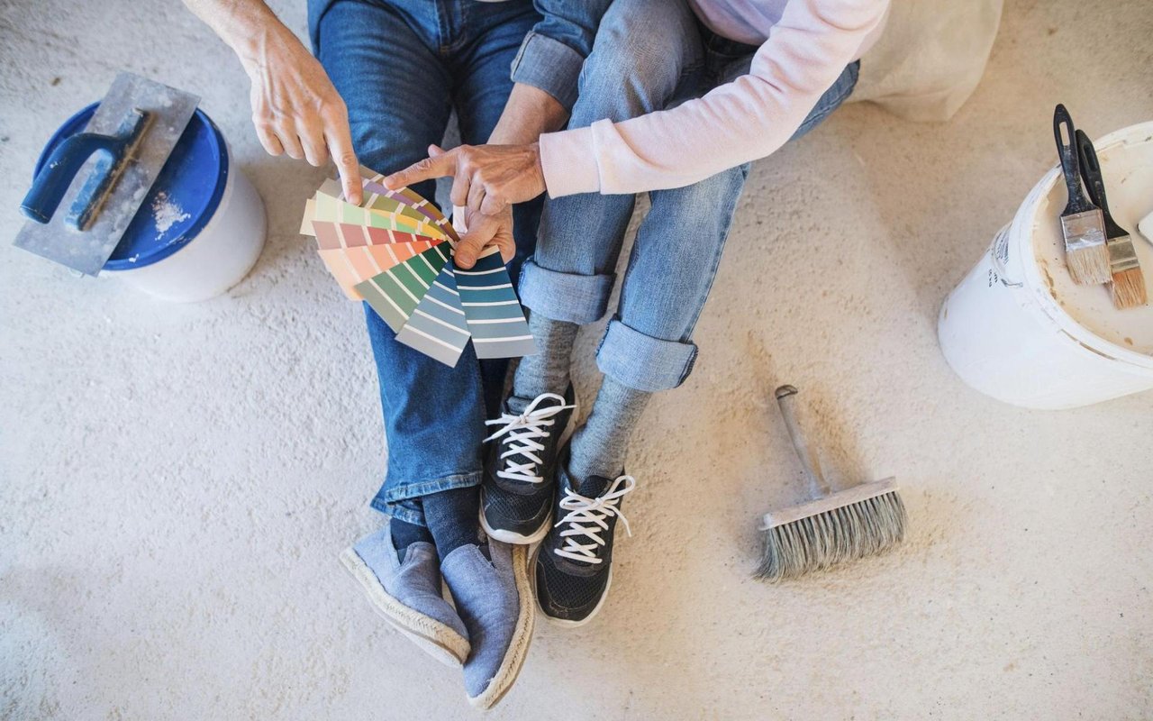
Color does much more than just make a room look nice. It affects your mood, shapes your perception of space, and can even influence your daily behavior. That’s why choosing the right paint tones for each room in your Streeterville home matters more than you might think. Whether you're getting ready for a design refresh or preparing your home for sale, understanding the science of color can help you make smarter choices.
You might be wondering: which color should I paint my living room to make it feel more warm and welcoming, or what shade will make my bedroom feel like a true retreat? This guide will dive into the psychological and visual science behind color so that you can pick the right paint tones for every space without second-guessing your choices.
Why Color Psychology Matters in Home Design
Color psychology studies how hues affect human behavior and emotion. It’s the reason cool blues feel calming while bright reds can feel energizing. When you understand how colors influence mood, you can intentionally design spaces that enhance how you feel and function in them.
For example, soft greens can promote relaxation and renewal — perfect for bedrooms or bathrooms. Meanwhile, a pop of orange or yellow in a workspace might help you feel more creative and focused. By making thoughtful paint selections, you’re doing more than decorating; you’re crafting a space that supports your lifestyle.
For example, soft greens can promote relaxation and renewal — perfect for bedrooms or bathrooms. Meanwhile, a pop of orange or yellow in a workspace might help you feel more creative and focused. By making thoughtful paint selections, you’re doing more than decorating; you’re crafting a space that supports your lifestyle.
Start With Natural Light and Room Orientation
Before you even pull out a color swatch, assess the natural lighting in the room. A color that looks soft and warm in a sunny, south-facing room might look dull or muddy in a north-facing space.
North-facing rooms tend to have cooler, dimmer light. You’ll want to counterbalance that with warmer tones — think creamy whites, sandy beiges, or warm grays. On the other hand, southern exposure brings in plenty of warm light, so you can afford to use cooler colors like soft blues, crisp whites, or even charcoal.
East-facing rooms receive bright light in the morning, which fades by afternoon, while west-facing rooms are dim early but glow warmly in the evening. Use these lighting cues to help guide your palette choices.
Lighting can dramatically affect how a paint color appears throughout the day, so always test samples on your walls and observe them at different times.
The Living Room: Comfort and Connection
Your living room is where people gather, relax, and connect. That’s why you want a color that feels welcoming without being overstimulating. Neutrals are always a safe foundation, such as light taupe, greige, or soft ivory, but don’t be afraid to add character.
Blues, particularly dusty or slate blues, bring a serene energy to the space and pair wonderfully with natural wood tones and modern furniture. If you want a cozier atmosphere, rich warm tones like terracotta, olive, or warm clay can make a larger room feel more intimate without overwhelming the senses.
Accent walls are a great way to incorporate bold colors without committing to repainting the whole room. Try a navy wall behind your sofa or a muted forest green behind your bookshelves for a sense of depth and drama.
The Kitchen: Energy and Appetite
The kitchen is the heart of your home, and the color you choose here can influence the entire vibe. Warmer tones like buttery yellows, burnt oranges, and earthy reds are known to stimulate appetite and encourage gathering. These colors can also add cheerfulness to a space that’s often used for both work and socializing.
If your kitchen is small or doesn’t receive a lot of natural light, lean into lighter tones like warm whites, sage green, or even soft peach. These hues can brighten the space and make it feel larger. If your kitchen has modern finishes like stainless steel appliances or dark cabinetry, contrast them with lighter or cooler wall tones to balance the visual temperature.
Another trick? Use color in unexpected places — like the inside of open shelving or the back of a glass cabinet — to add personality without committing to a bold wall.
The Dining Room: Warmth and Elegance
Dining rooms are ideal for colors that feel both intimate and elegant. Deeper hues like eggplant, deep teal, navy, or charcoal gray work well here because they create a cozy backdrop for evening meals and gatherings.
If you're looking to brighten up the room for daytime use, try a soft coral or blush — something that adds just a hint of warmth. Metallic finishes and textured wallpapers in these shades can elevate the room and add depth without overwhelming the space.
Because you likely won’t spend all day in the dining room, this is one area where you can be a bit bolder with your color choice. It’s a great space to express your personality while still maintaining a sense of sophistication.
Bedrooms: Calm and Comfort
Bedrooms should feel like a restful retreat, and the right colors for achieving this are often found on the cooler side of the color wheel. Soft blues, pale grays, lavender, and sage greens are all calming options that promote relaxation.
If you prefer a warmer palette, opt for muted tones like dusty rose, warm taupe, or creamy beige. These still offer a cozy feeling without stimulating the senses too much. Avoid overly bright or saturated colors like fire-engine red or neon green, as those can feel jarring and interfere with your ability to unwind.
Another tip: try layering different tones of the same color. For example, a misty blue wall paired with darker blue accents and navy bedding creates a cohesive and calming palette without feeling one-note.
The Bathroom: Clean and Refreshing
Bathrooms tend to be smaller spaces, so your color choices should enhance light and create a sense of cleanliness. Light, airy tones work best — think pale aqua, soft gray, crisp white, or pastel green.
If you’re working with a windowless bathroom, try to stay away from darker colors. Reflective finishes like semi-gloss paint and light-colored tile will help bounce light around and keep the space feeling fresh.
Monochromatic color schemes with variations of the same hue can make small bathrooms feel larger and more unified. You can also play with contrast — like navy walls with white tile — for a dramatic but still classic look.
The Home Office: Focus and Inspiration
Your home office needs to balance productivity with comfort. That’s why color choices here are so important. Blues and greens tend to support concentration and calm, while shades of yellow or orange can boost energy and creative thinking.
For a balanced workspace, consider grounding colors like muted olive, slate blue, or warm gray. If you want to feel more energized, go with a pop of coral or mustard on an accent wall or in the form of painted shelving.
Avoid stark white, as it can feel sterile and draining after long hours. Instead, use soft off-whites or light gray as a base, and add energy through accent colors and décor.
Let Color Work for You
Choosing the right paint tones for every room isn’t just about matching swatches; it’s about shaping how you experience your home every single day. When you understand the science behind color and how it influences mood, space, and energy, you’re no longer guessing — you’re designing with intention.
If you’re ready to find the perfect home in Streeterville today, connect with Julie Latsko for trusted guidance.
If you’re ready to find the perfect home in Streeterville today, connect with Julie Latsko for trusted guidance.